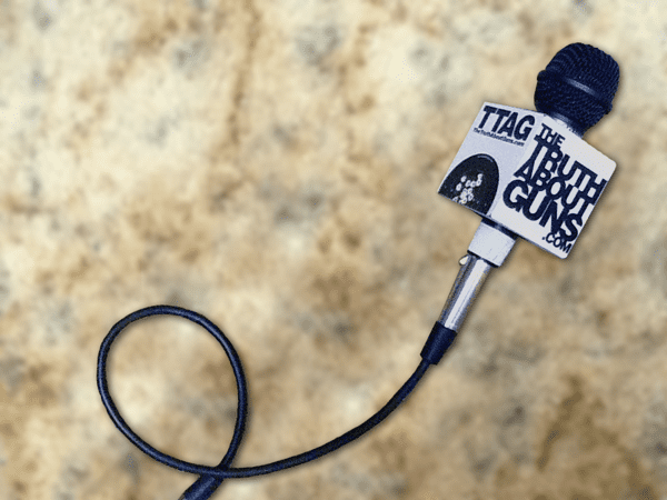
Okay, so this is not exactly a post about guns. It’s a post about a site that covers guns. Namely us. So I guess it’s a metapost, if you wanna get all metaphysical and such. Anyway, along with our impending release of TTAG TShirts and other future swag, we thought it might be a good time to update the ol’ look and feel. As always, we want the input of the TTAG Armed Intelligencia. Your thoughts?


Like the new logotype. One look/feel suggestion: move that damned share/save link thingy way over to the right. I’m constantly running over it and making it pop open. Grrr. Pet peeve.
Agreed! Thing is a nuisance.
Hmm. I’d be interested to know if anybody’s using it. It’s a plugin. Not easy to reposition the thing. But if it’s not useful, it would be easy to get rid of it. So…anybody feelin’ the love for the popup?
Never mind…I think I’ve found a way to make everybody happy. They recently updated the plugin, and allow us to set it up so you have to CLICK it, to see the menu. Happy?
Definitely. Thanks!
I new it couldn’t be easily moved, so I didn’t complain. But Thank You! It was as annoying as a Bonehunter™ on the next lane.
Needed to be said.
I’m digging it Brad.
Hey Brad,
Looking good man, nice work! I like the microphone wrap too – if only we had a professional film crew to go along with it and take to Pitt!
Any way to “correct” the color on the Shoot-n-See? It looks like you can almost tell where it was laid on a scanner in a few places (the dim horizontal lines). Also, it seems like the “old” banner was “sharper” in the definition of the bullet strikes; did we lose some res somewhere?
re: Twitter plugin – there’s a bunch of empty space on our top-nav bar, maybe we can find a way to embed the Twitter thinger and a Facebook do-hickey up there instead of it hanging on to the left side of the screen and going with us everywhere? (unless that was the intent 🙂 ).
Edit to the above – The Shoot-n-See looks perfectly fine on one of my monitors, but on the higher resolution monitor the scanner lines are evident. Maybe it’s not a problem for everyone else.
That’ll have to do until we get back from Pitt. I’ve gotta drive to Dallas to catch my early morning flight. Actually, it looks pretty good on my hi-rez Mac monitors, but what bugs me is that the colors are different on every monitor – even between the external and laptop monitors. And Day-Glo colors are notoriously hard to reproduce on anything. The scan actually read the green as white – I had to do a lot of Photoshop manipulation to get it to look like the original.
Far as the Twitter/FB stuff, I’ll look into it. That’s a plugin that is designed to slide down the page edge. I find it kind of annoying, but you’re the only other person who’s mentioned it.
In that case, one Helluva job re-coloring the Shoot-n-See Brad! I couldn’t even tell that that was ‘shopped to get the colors back from white. You’ve got an eye for design good sir!
Spiffy and fresh. I’d be excited for t-shirt availability.
Brad, I like it. Crisp, clean, and no hokey gun silhouette.
Very Tarantino!
I like. What font it that? Please don’t nap on those t-shirts. I want.
I like it. Well done. On my iphone, something does seem possibly amiss about the Shoot-n-Sees, but that might be my imagination. Anyway, good work!
Comments are closed.